For a world
without hunger
Welthungerhilfe
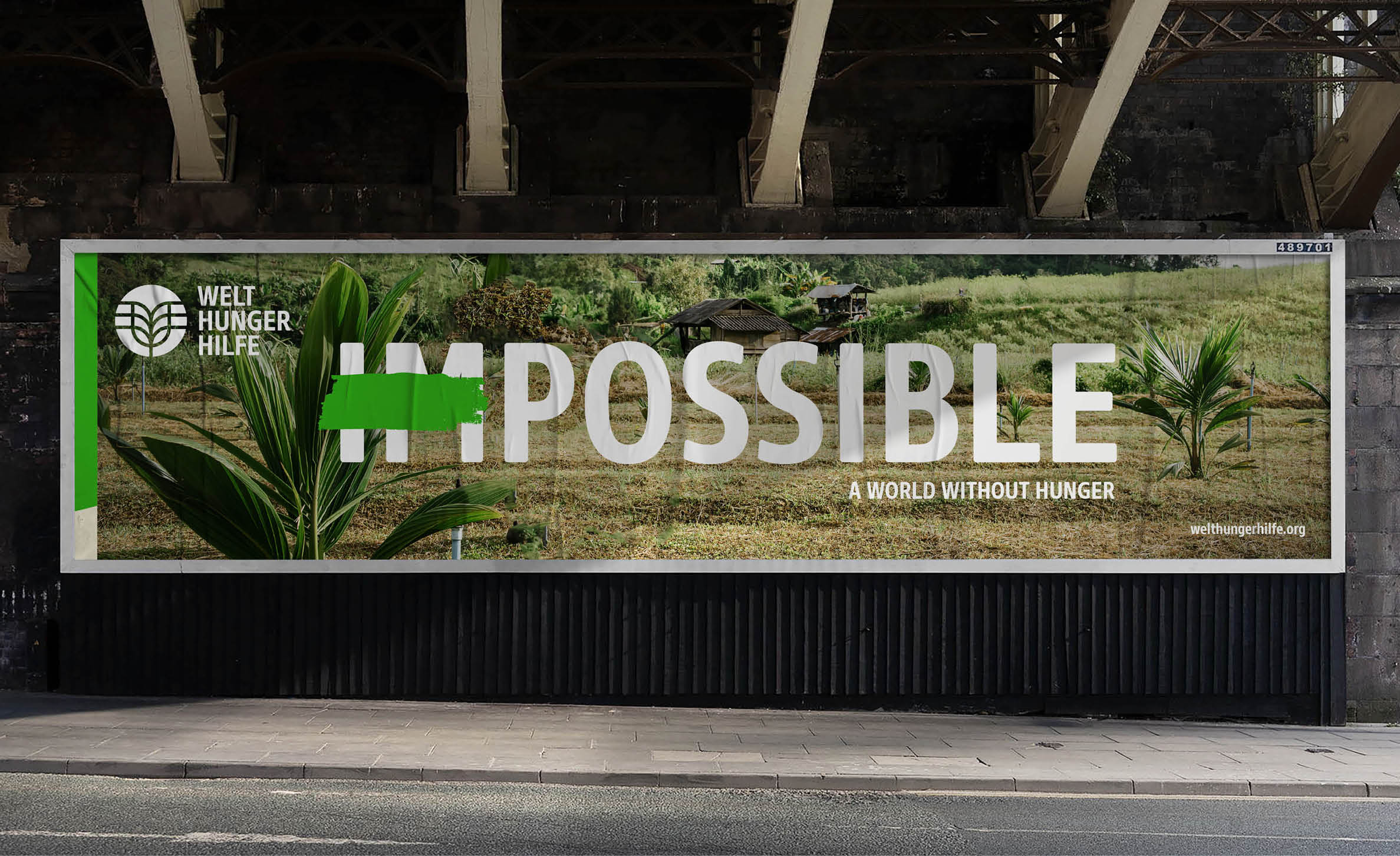
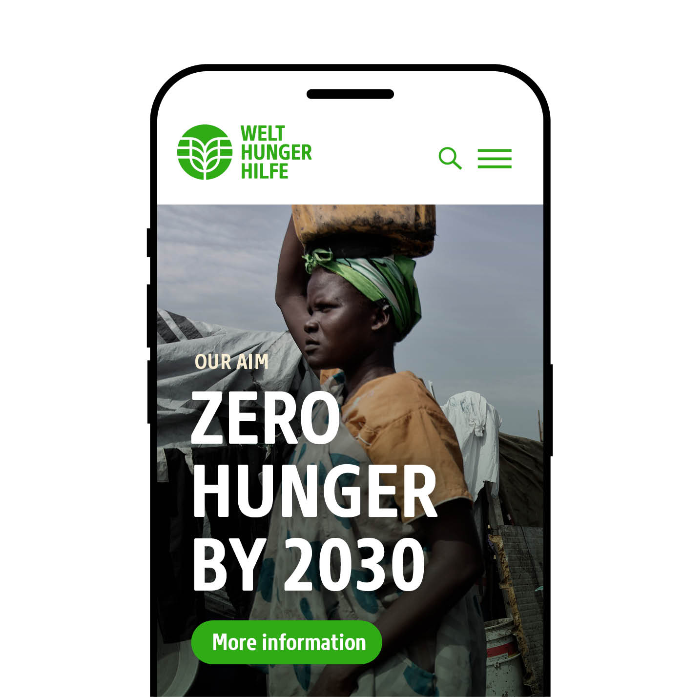
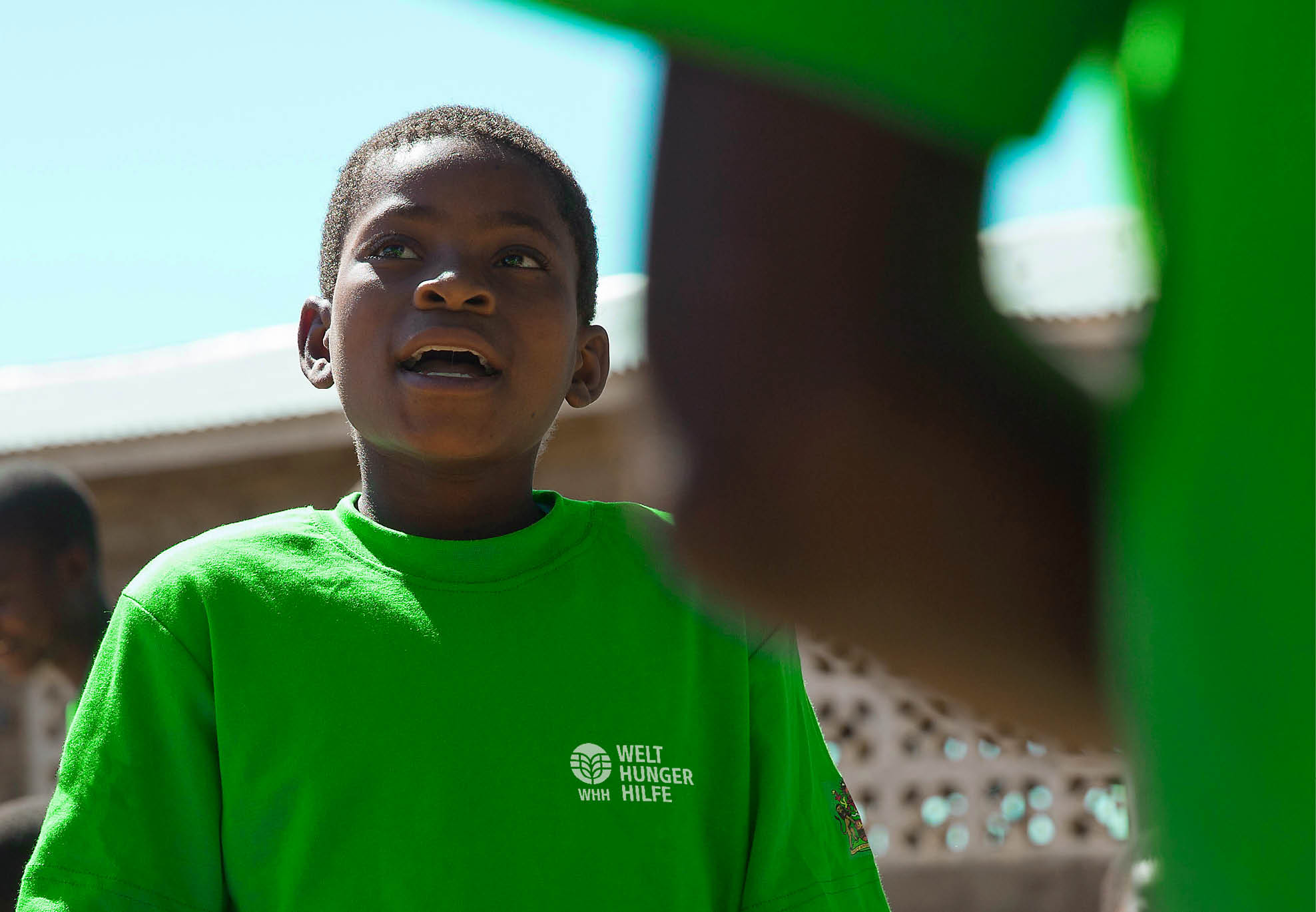
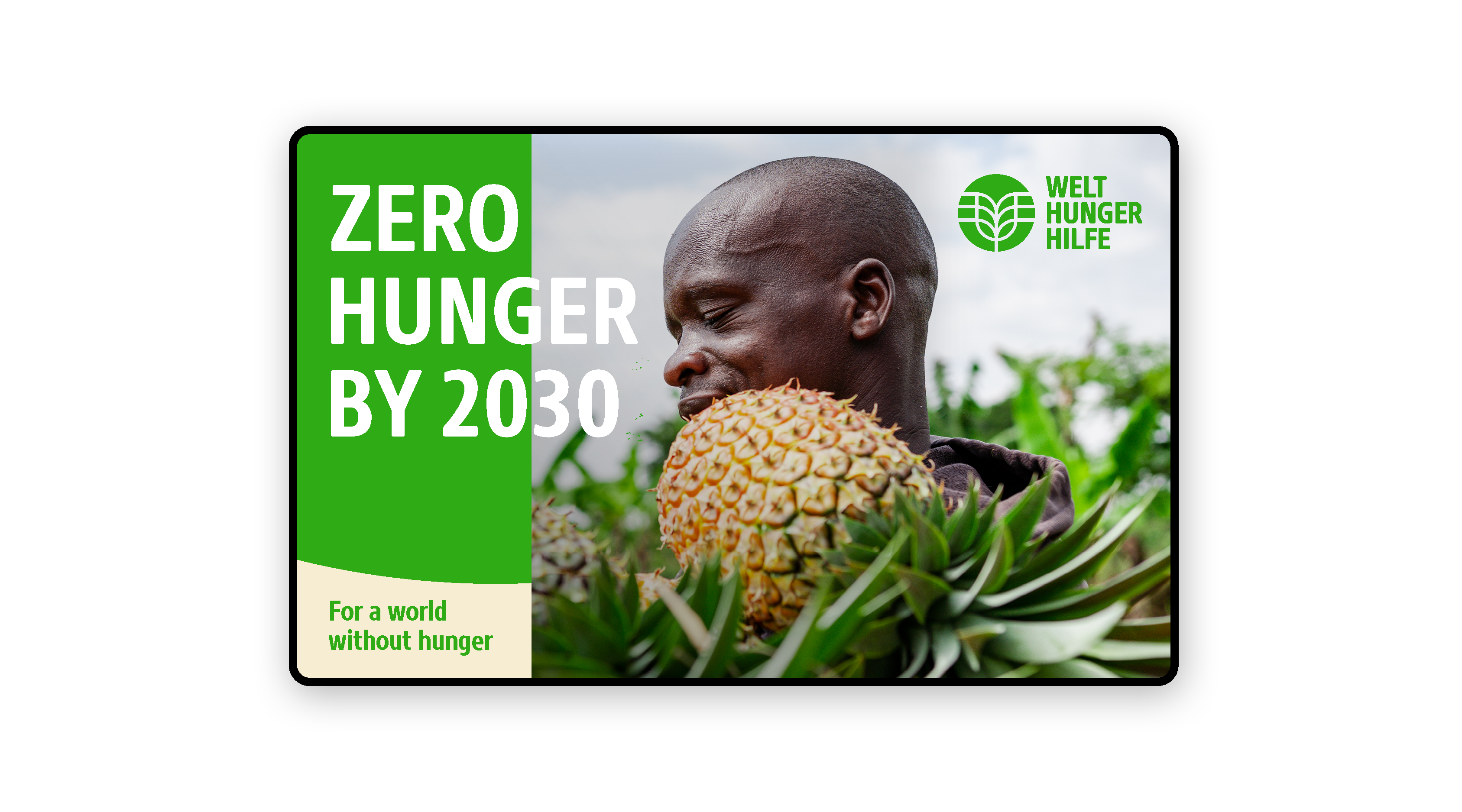
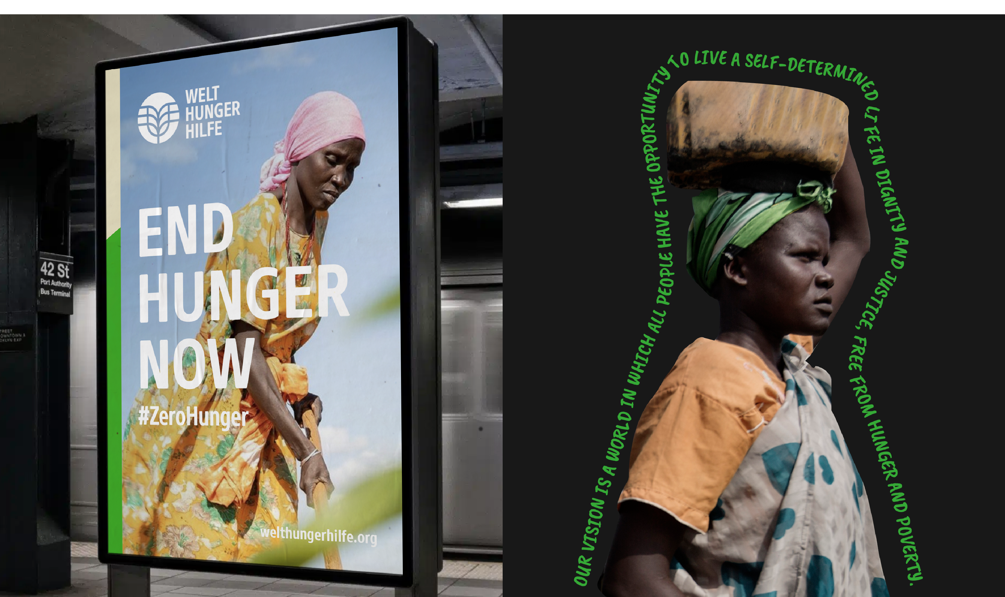
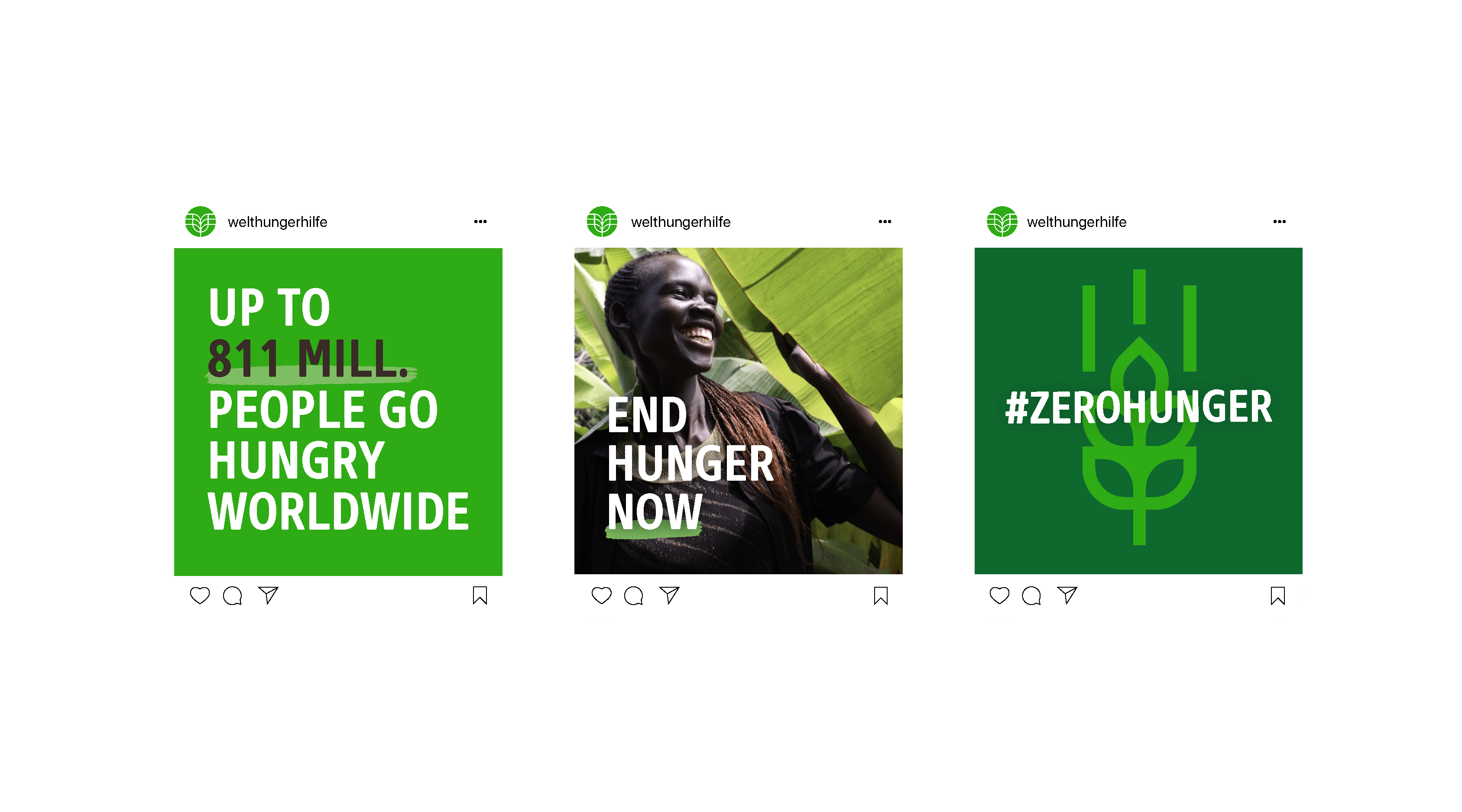
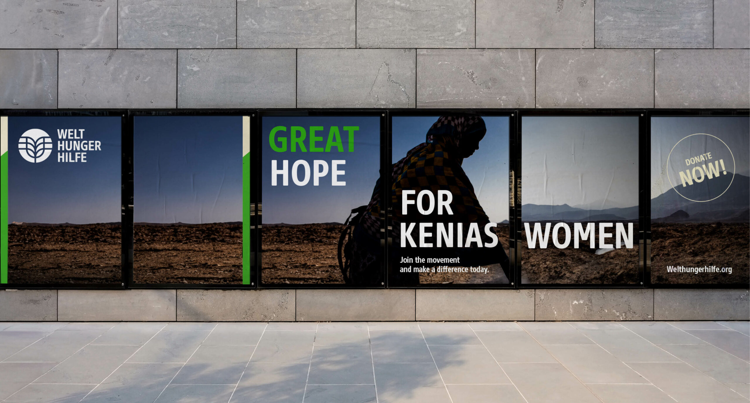
The goal of the redesign was to strengthen the brand's visibility and prepare it for the challenges of today's world. In the process, brand-defining elements such as the logo, the imagery and the color scheme were carefully developed further. The brand now sports a fresh typeface marked by its gentle edges and strong framework, reinforcing the brand's character and playing a key role in its updated identity.
Designteam: Olivier Nowak, Malte Preiss, André Metzen, Christoph Henschel, Juergen Krugsperger, Heiko Franke, Felicitas Diepolder, Summer Tran, Yvonne Haupt
Made at Scholz and Friends.
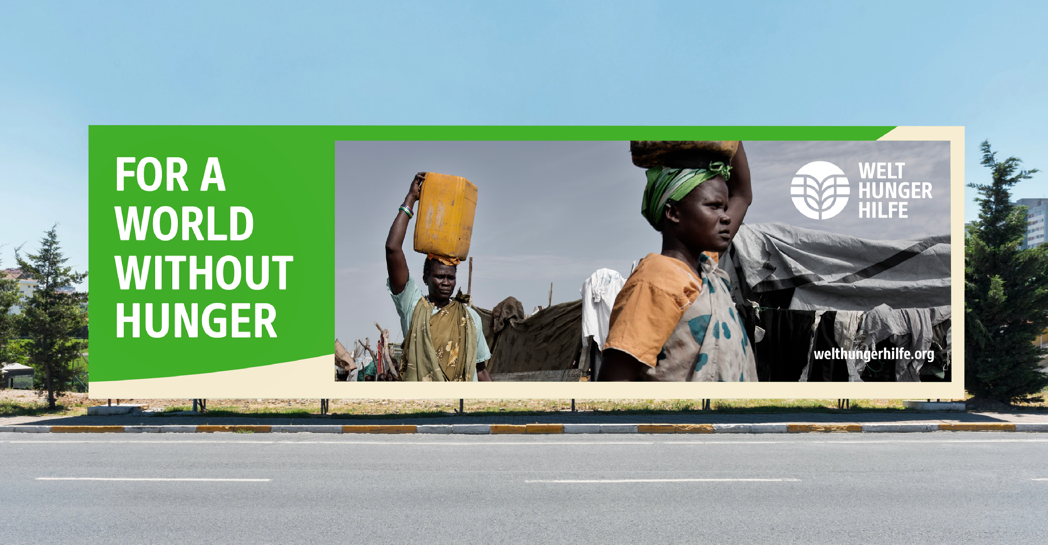

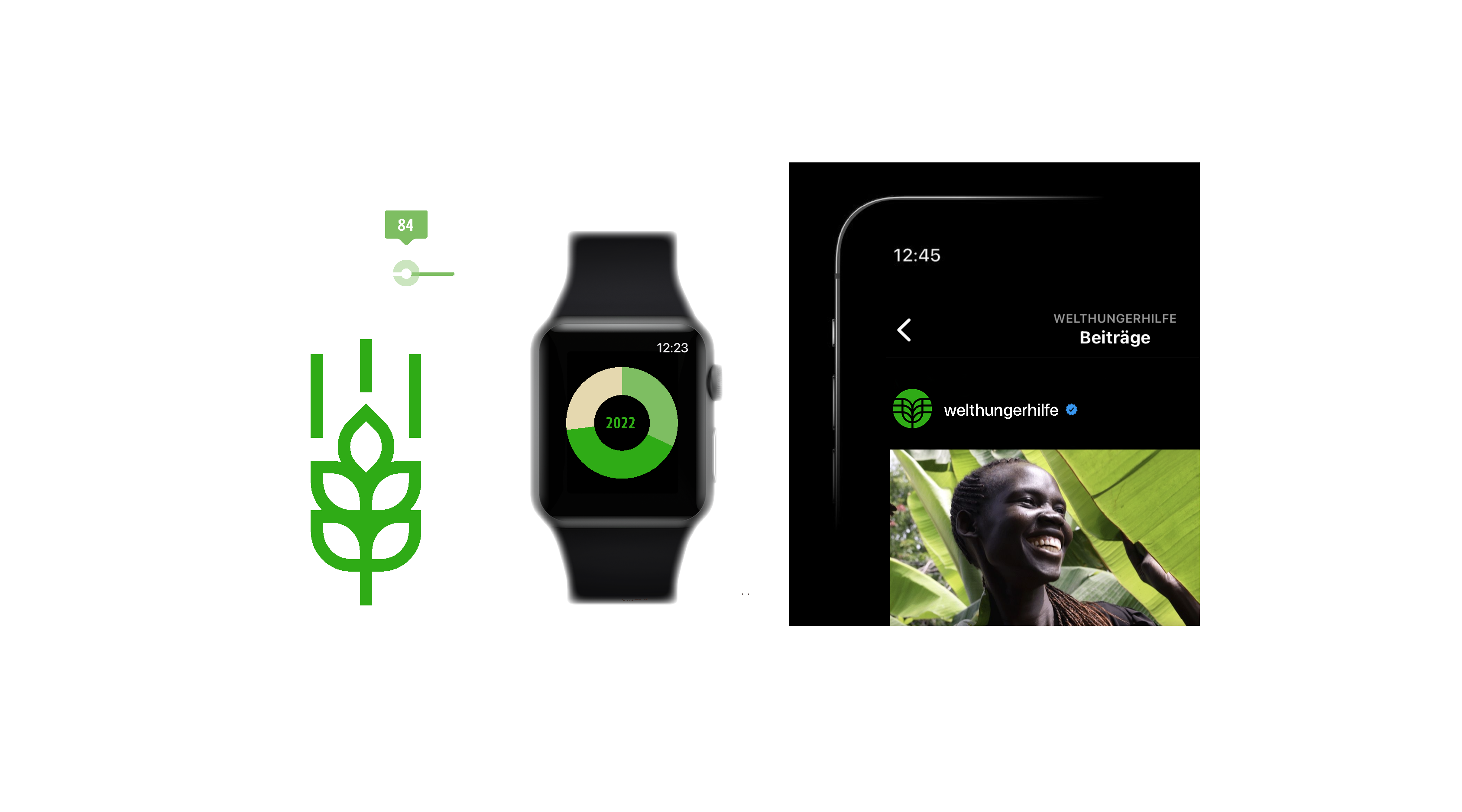
The symbolism of the ear of corn and the globe, which has been part of the brand since its inception, was carefully developed further and optimized for digital channels. The powerful symbol of the ear of corn now merges with the globe, the awns of the ear of corn grow outward and become the meridians of the world.
Related projects
©SIZE 2026. All Rights Reserved.