The joy of an
intellectual debate
NZZ Am Sonntag
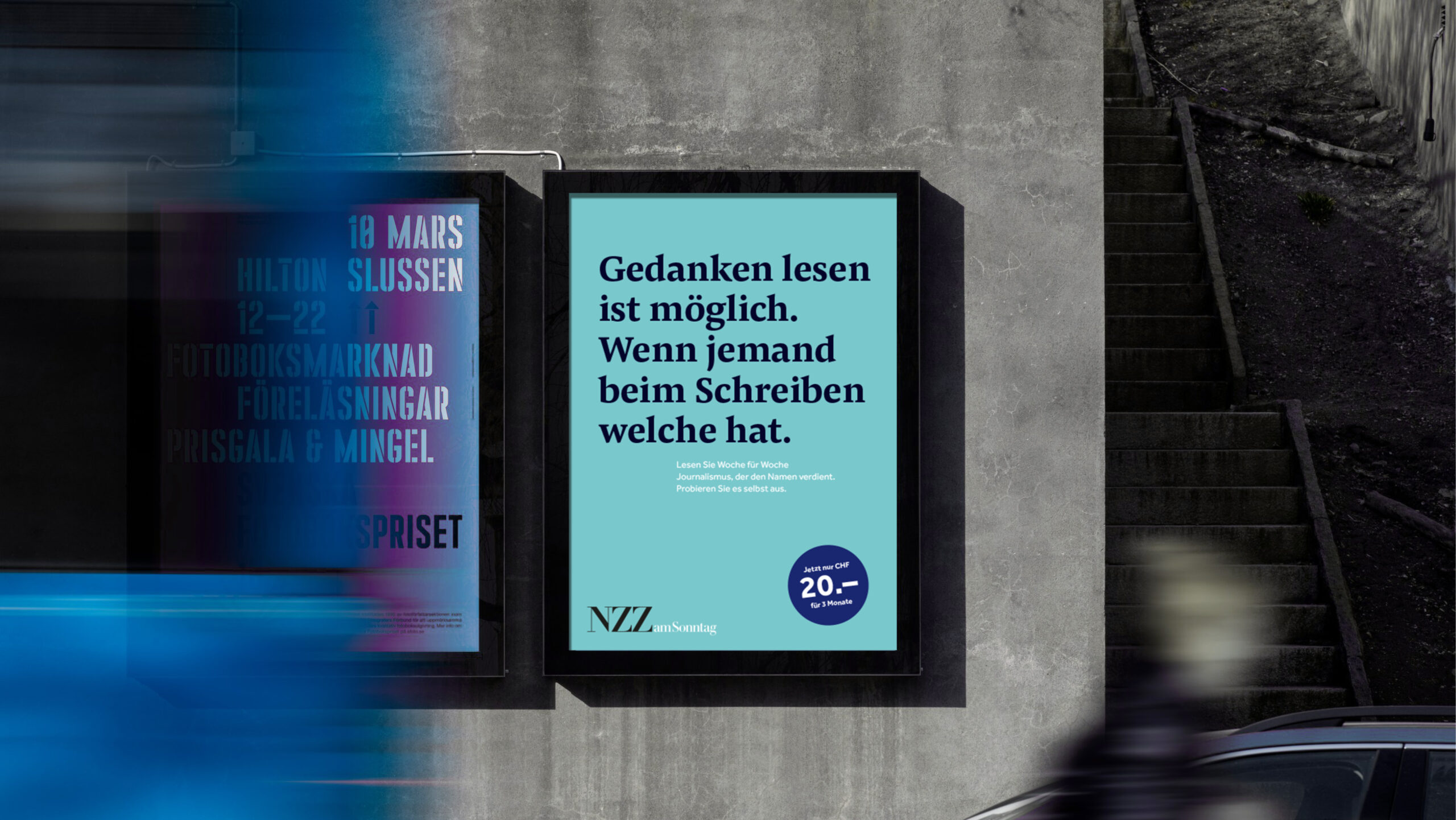
The NZZ Media Group has undertaken a visualoverhaul of its Sunday newspaper in colla-boration with Tyler Brûlé, with the intention of accentuating the magazine-style essence of the publication.
Simultaneously, we were honored with the task of refining the brand. In partnership with Scholz & Friends Zurich's strategy, we redefined the brands and their objectives, culminating in a distinctive brand identity. The central theme throughout was "The joy of interlectual debate".
Designteam: Olivier Nowak, Tobias Haendler, Mathias Rösch, Luca Stancheris, Désirée Denner
Made for Scholz and Friends Zürich.
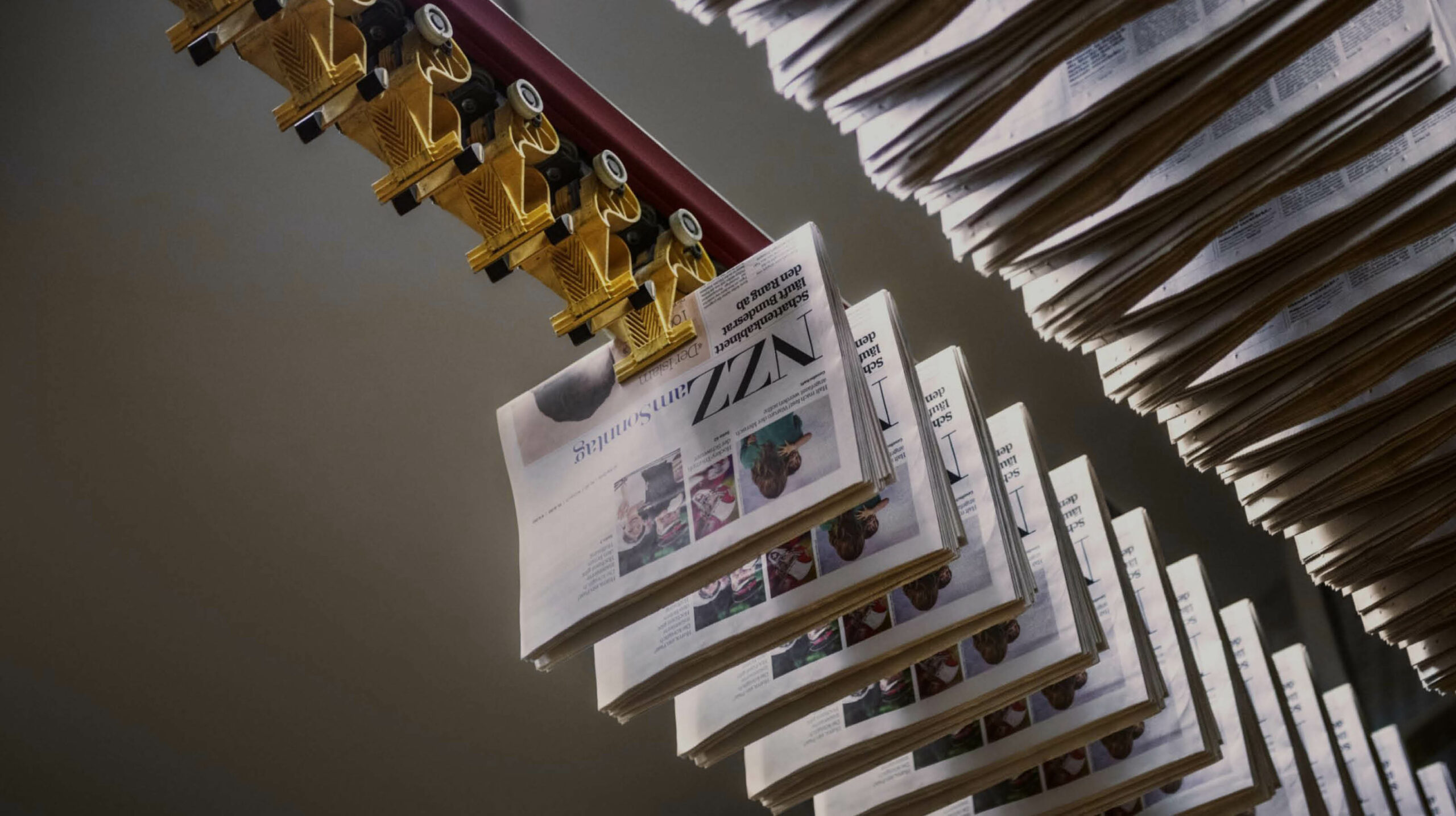
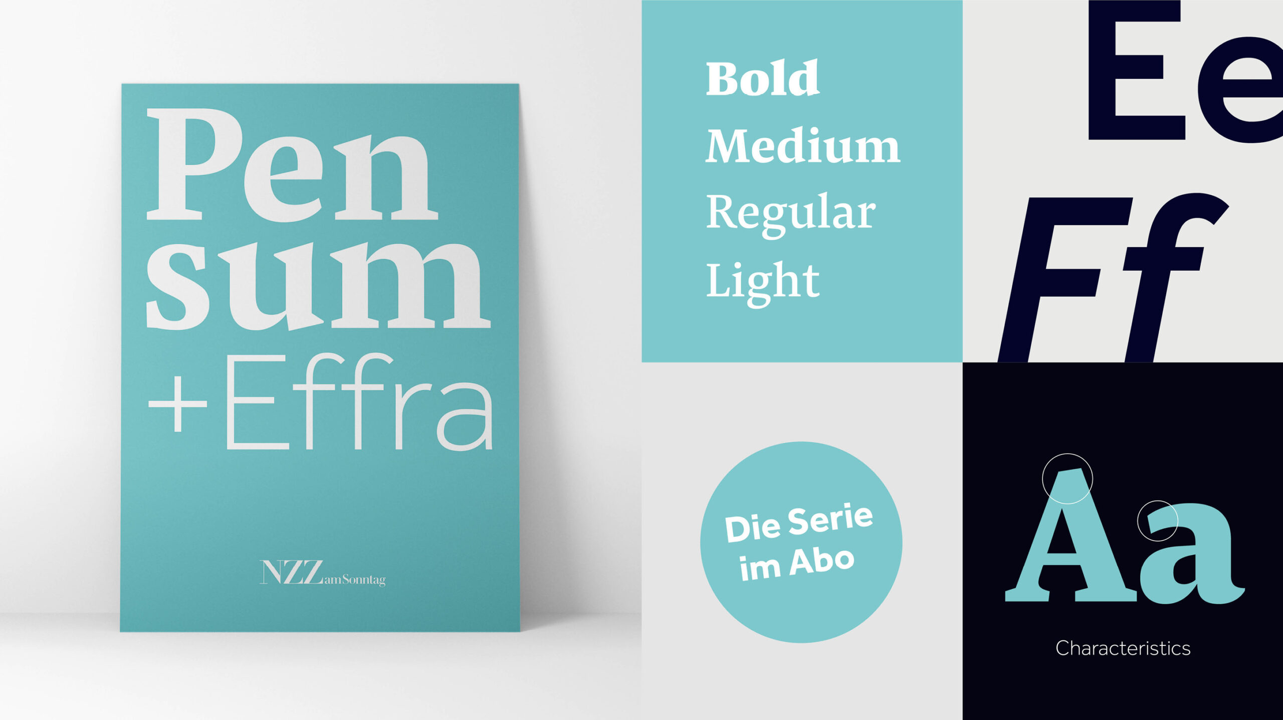
In choosing the typefaces, we opted for a combination of a serif and a sans-serif-font.
The combination of these fonts meets the aesthetics we aimed to achieve for the NZZ's visual identity and fulfills the technical require-ments these fonts need to meet in their usage.
The Pensum Pro is clear, elegant, and, with its hidden and breaking subtleties, ensures a strong
indi-viduality and a modern design language. The Effra font provides a modern contrast to the
tradi-tional NZZ lettering in Fraktur script. As a sans-serif typeface, it creates a harmo-nious and intriguing counterpoint to the Pensum Pro-Hero font.
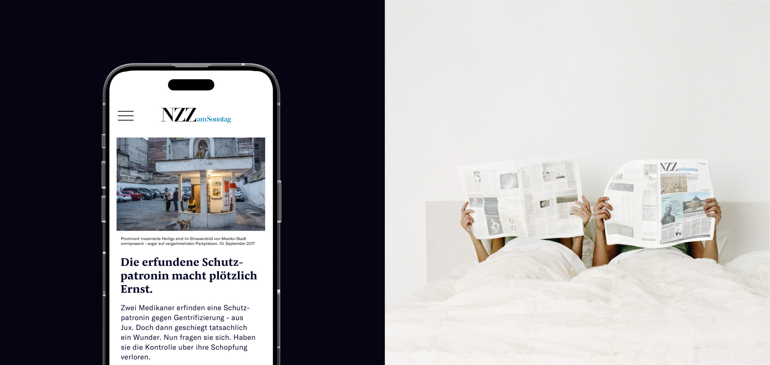
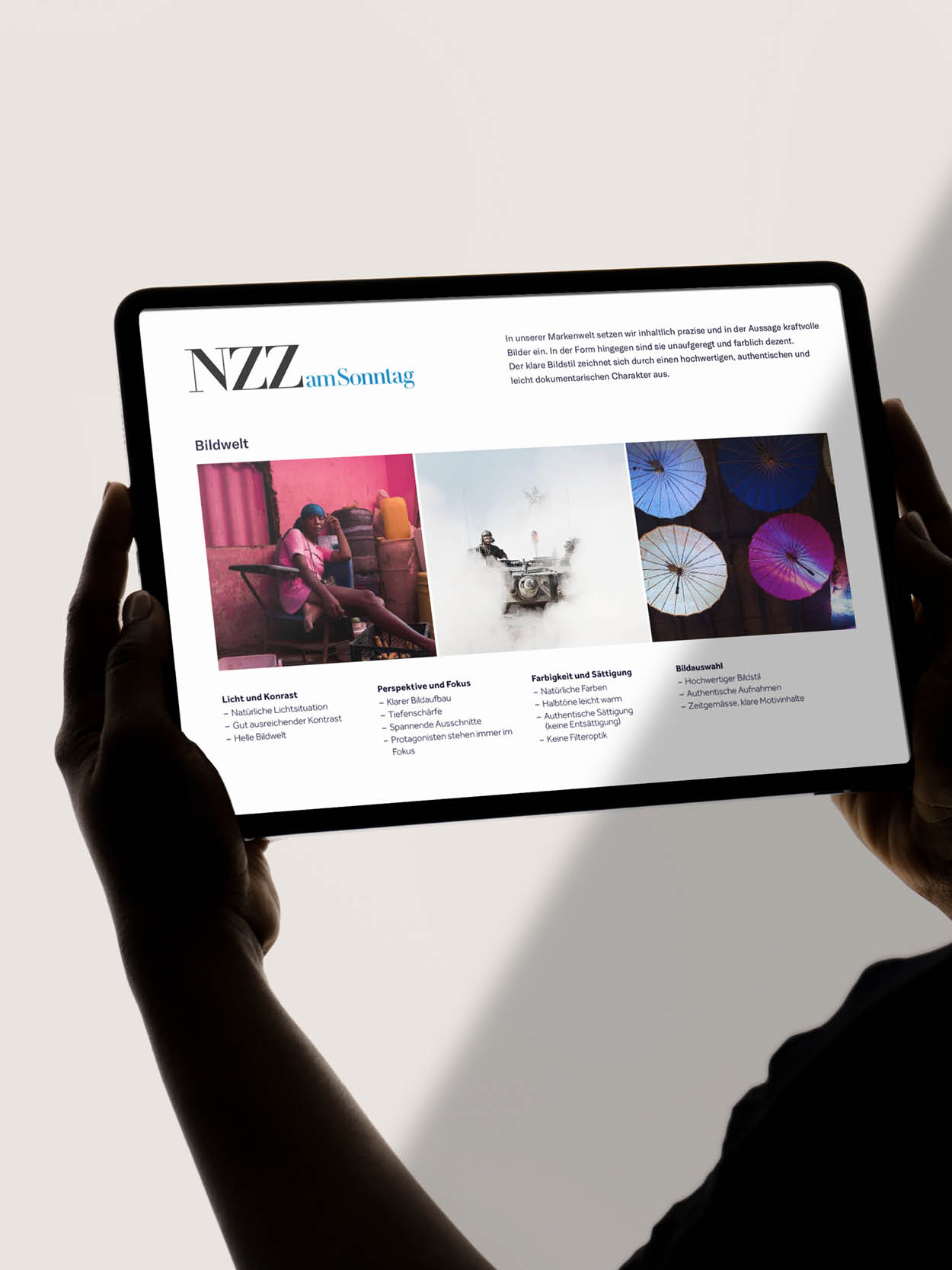
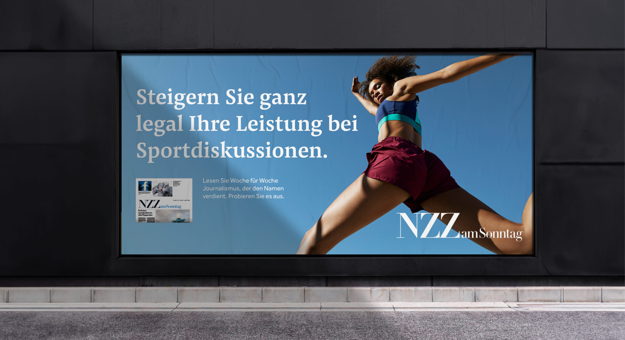
In the brand universe, we use visually precise and impactful images. However, in terms of their form, they are understated and subtly colored. The clear visual style is characterized by a high-quality, authentic, and slightly documentary character.
Related projects
©SIZE 2026. All Rights Reserved.