Redefining
Modern Living
Akasha – Home of Growth
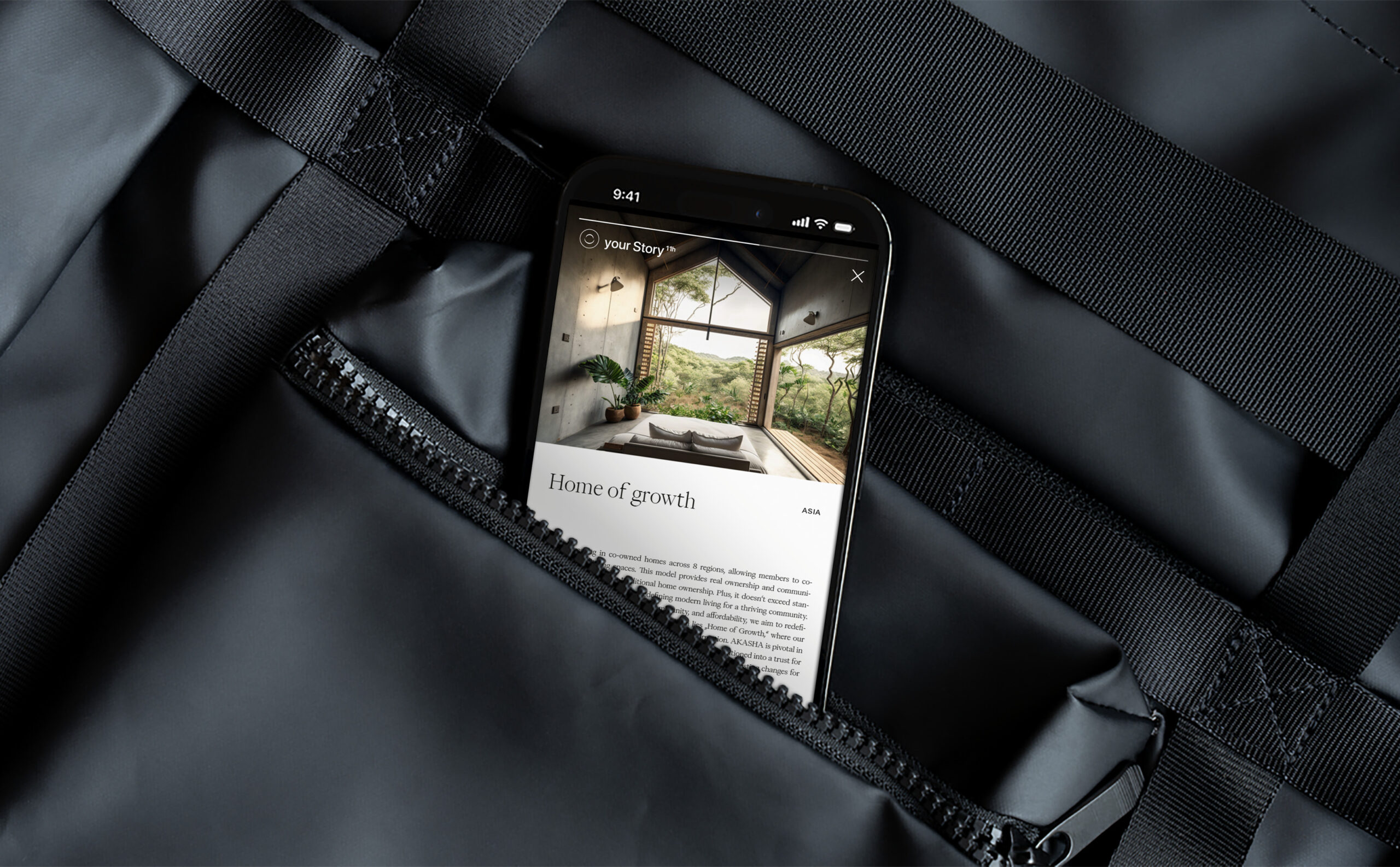
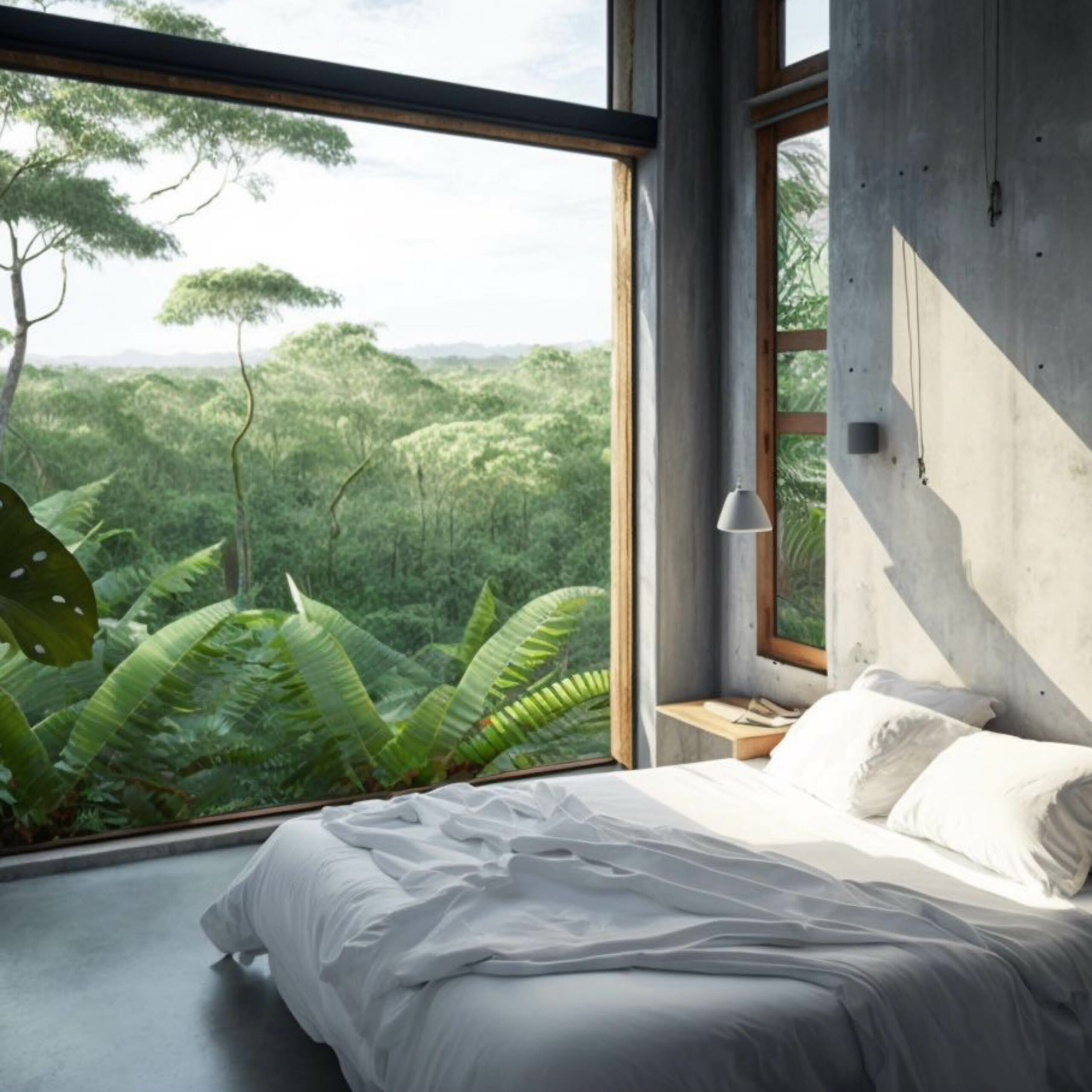
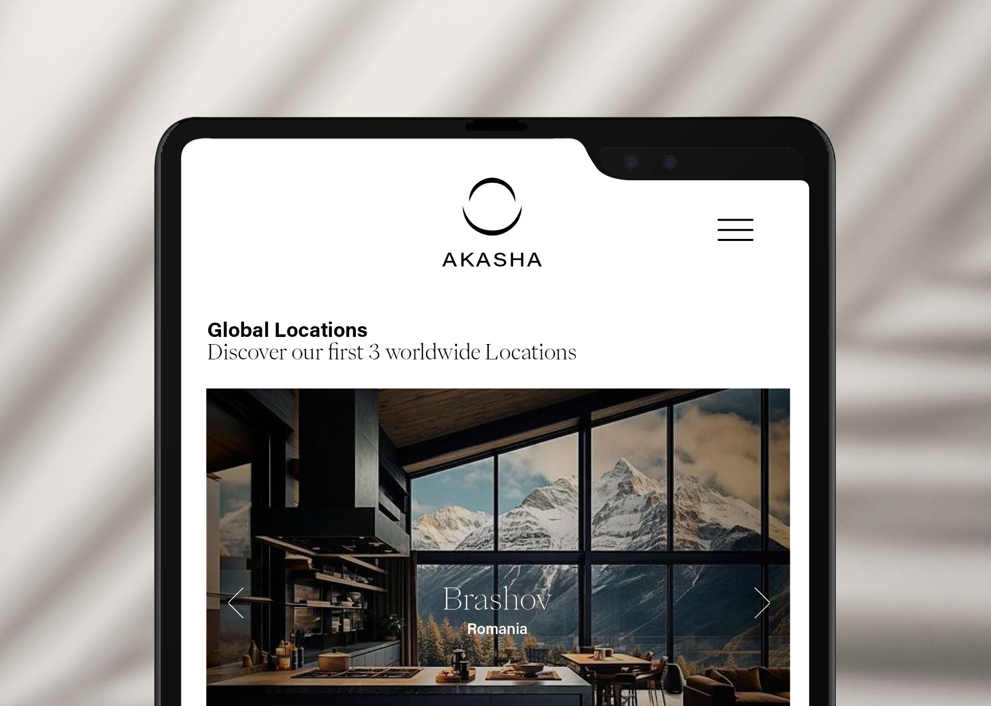
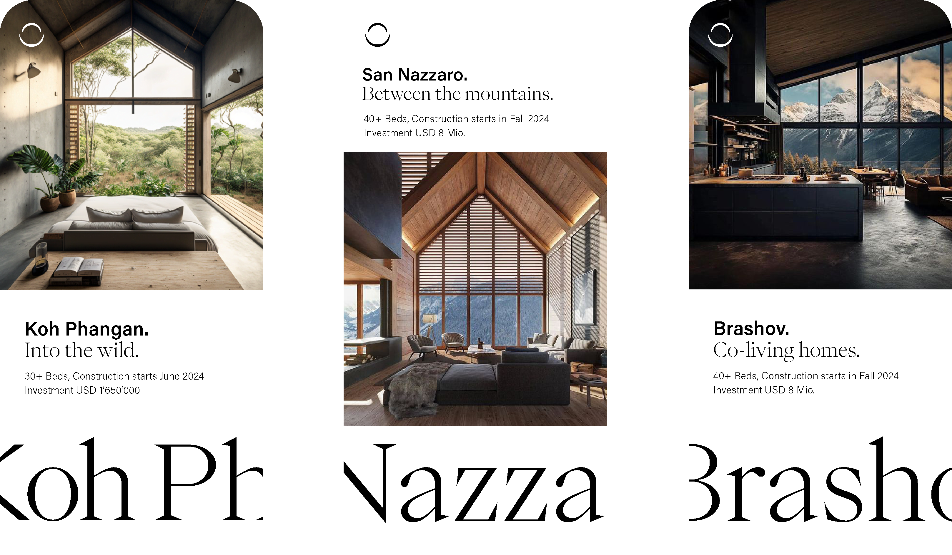
The young co-living model has been conquering international markets for some time now. Temporary or permanent shared living in apartment buildings offers new solutions for the international urban housing market. Akasha offers the opportunity to live and work remotely within 3 destinations.
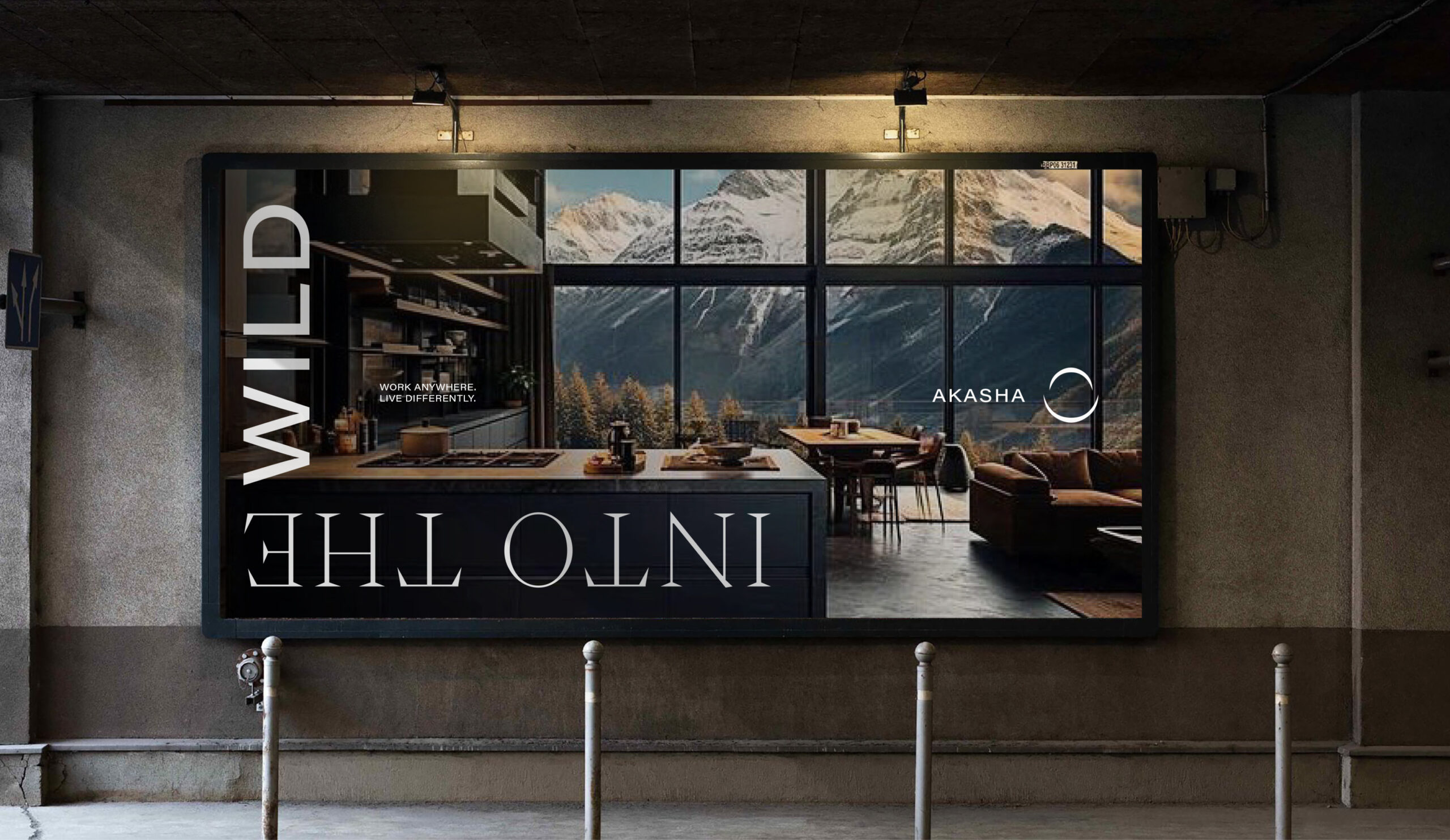
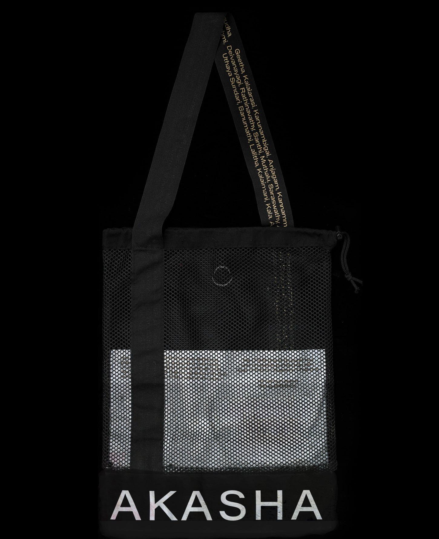
With this objective in mind, we crafted a fresh brand that seamlessly integrates living and working in the upper price segment. Rethought.
Designteam: made by size
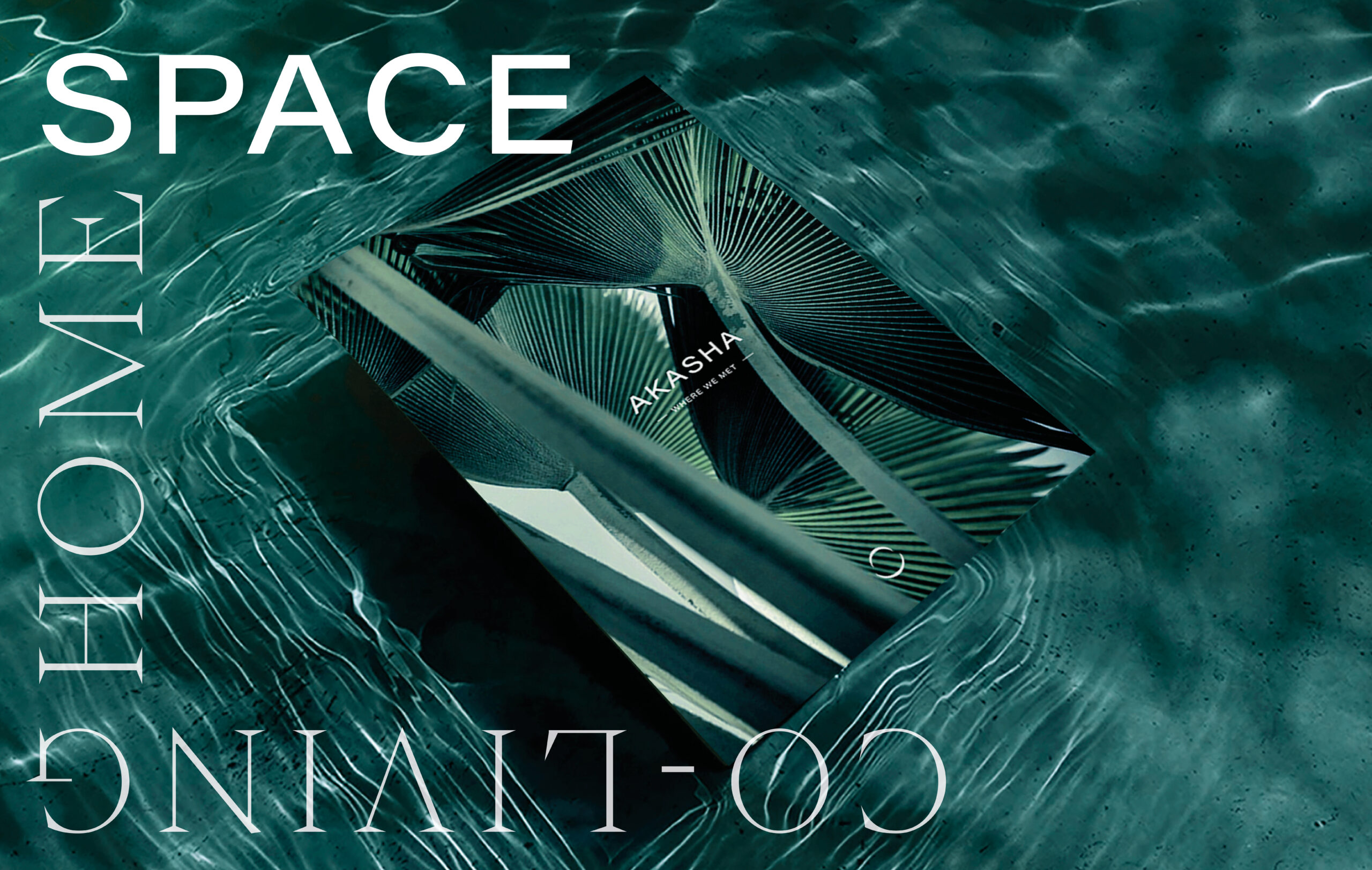
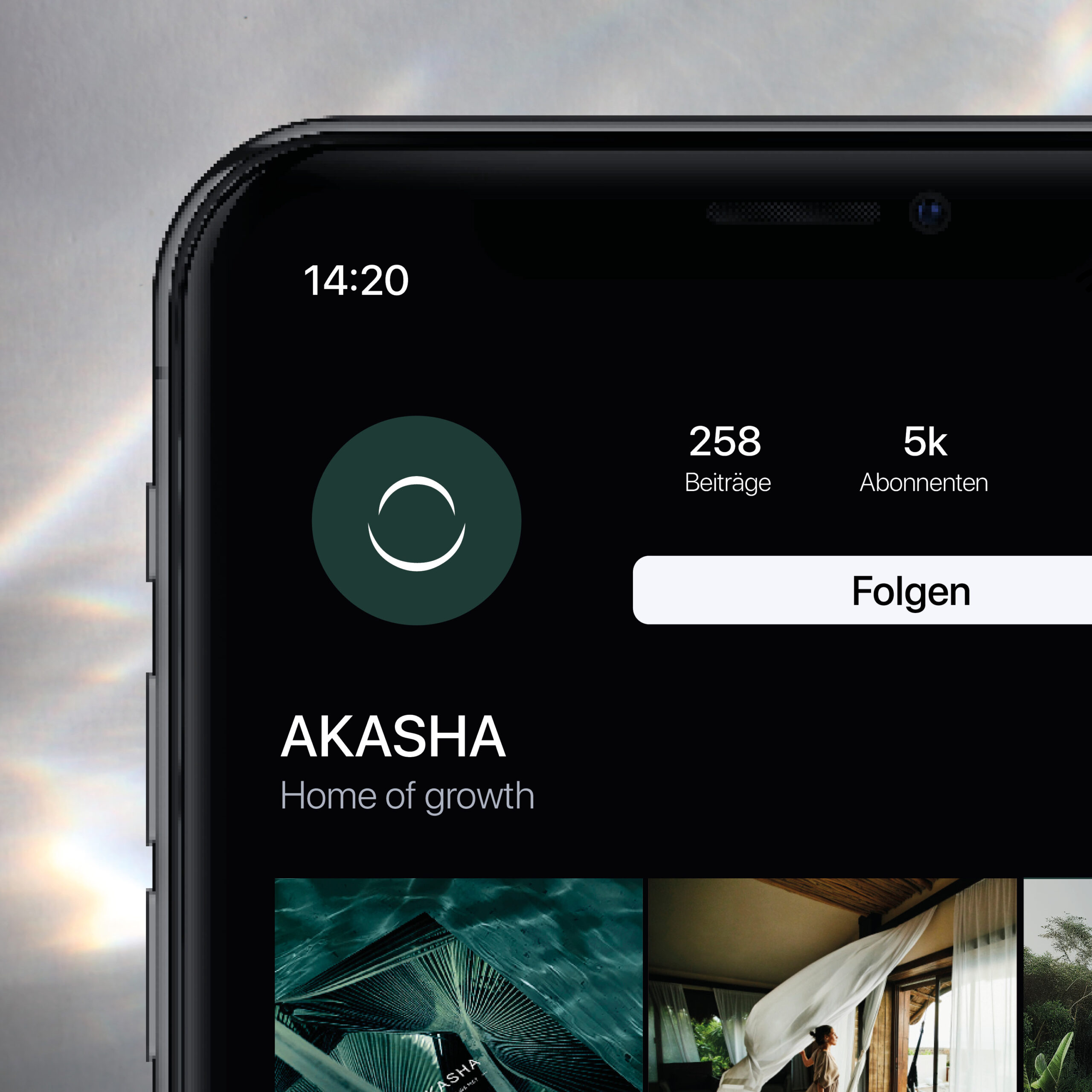
The genesis of the logo derives from Buddhist teachings, where "Aksasha" signifies the fifth element. The ether that surrounds everything and forms space. Within the logo, this space is represented by an open circle, a strong foundation for everything that will be created.
For the brand's aesthetic, two fonts were carefully chosen to evoke both strength and finesse. PP Eiko and Acumin complement each other seamlessly, encapsulating the desired brand identity.


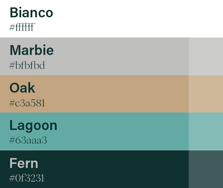
The color palette is inspired by nature.
Elements such as water, fern, or wood have been translated into a color code and brought into a harmonious color balance.

The construction projects will be completed
by the end of this year. Further applications in signage, digital, and events will follow.

Related projects
©SIZE 2026. All Rights Reserved.